What is Rieker.ca?
Rieker is a footwear brand based in Canada. They sell all types of footwear for men and women including shoes, sandal, slip-ons. I was assigned the task to conduct a UX audit for them to improve their user experience.
Duration 10 Days

Objective
Our objective was to find out the UX flaws within the site which was resulting in high bounce rate, low customer retention, relatively high abandoned cart on rieker.ca website. The client wanted us to highlight the problems, analyze it and provide a solution for them to implement and increase their conversion ratio thus translating into higher sales.
Methods Applied
Observation
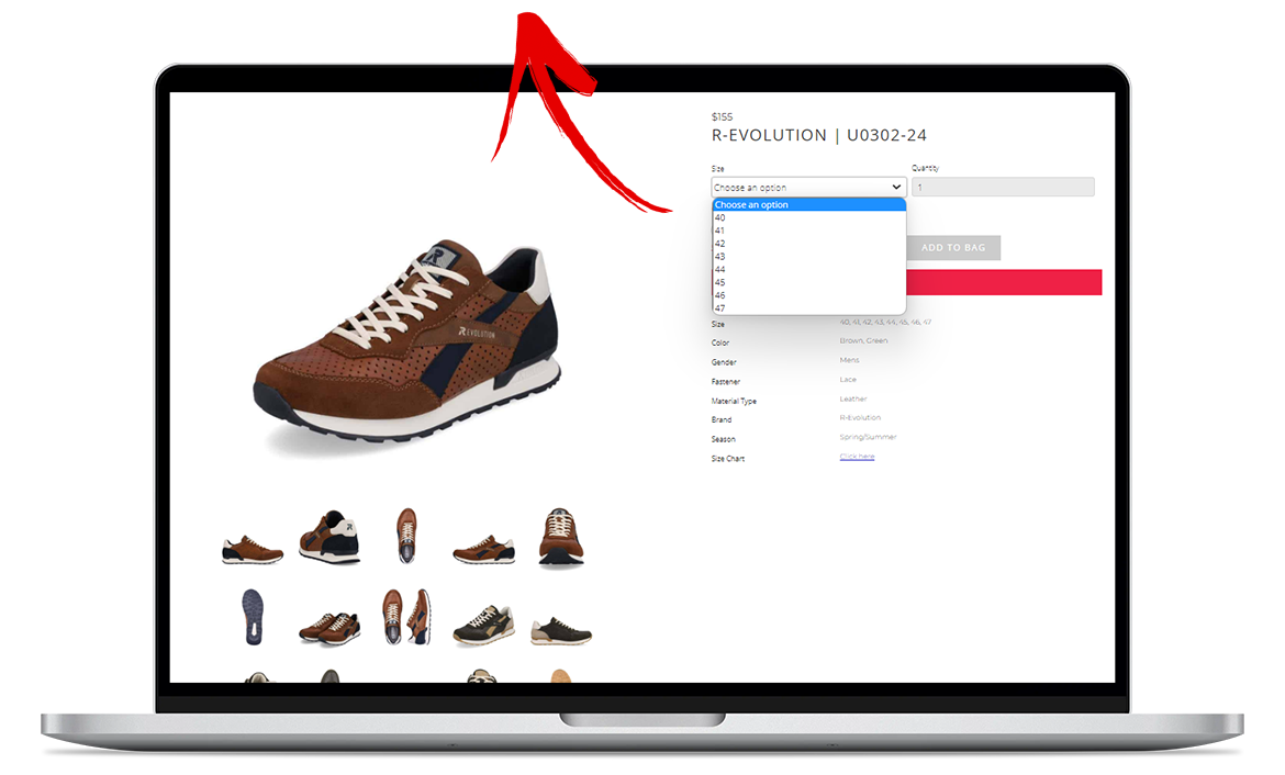
Overwhelming majority (i.e: 94%) of users are from Canada, thus we need to ensure we are catering for them through every user touchpoint. The product page does not show the sizes in standard Canadian numeric.
Solution
The very least we can have are drop-downs for both US & EU sizes instead of letting them calculate through a size chart alone, preferably prioritizing the EU size which is more common in Canada.
Conversion Ratio
Conversion rate 0.96% for Rieker is a bit low. Average conversion rate of an e-commerce website is 2.5-3%.
We can reach that goal or even do better:
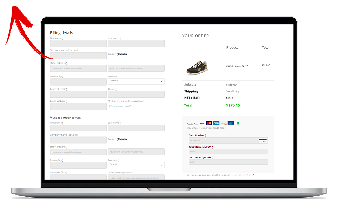
- By making the checkout process smoother and not cognitively overloading the user.
- By making the navigation of website less cluttered so users can easily access the relevant products.
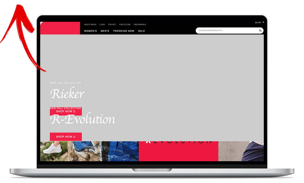
Sticky Headers
Sticky headers are now a part of a design standard. We have to ensure that wherever users will go on the website, the accessibility of key actions is ensured.
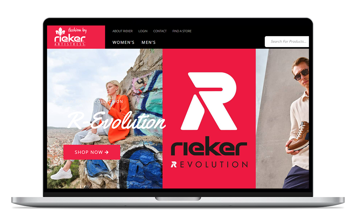
Rieker website does not have sticky headers. If the users scrolls down and wants to go to women’s collection, they’ll be forced to scroll up back to the top.
Observation
Rieker’s performance is a problem when it comes to a smooth user experience and user retention. Largest Contentful Paint (LCP) is 2.7s which could be improved. Cumulative layout shift(CLS) of rieker.ca website is 0.938.
Website is a little slow and has usability issues like consistency and standards, invisibility of system status.
Solution
CLS and LCP can improve in many ways:
- Adding skeletons of pages
- CSS can be improved
- Remove the extra java scripts in the code
- Use better sized images
- JPEG instead of PNGs which are being used
Chatbot/Live Chat Agent
Chatbot can be effective for the website in following ways:
- Product guidance
- Abandoned Cart recovery
- 24/7 customer service
- Reduce customer frustration
- Increase sales
- A search in 2017 shows 29% of consumers are more likely to make a purchase with the option of live chat even if they don’t use it and 41% of online shoppers trust the brand when they see a live chat
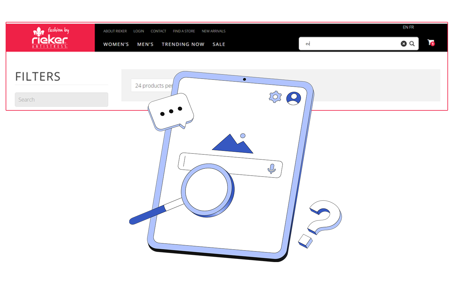
Observation
Predictive search is a key functionality. Search bar does not predict the keyword instantly neither shows the brand, categories, rather just the product codes.
Solution
Search bar saves valuable minutes for users trying to find a product that fits their preferences, search functionality should be intuitive and predictive in order to speed up the process. Things like just matching the spelling of their search term and suggesting relevant keywords to what they are looking for.

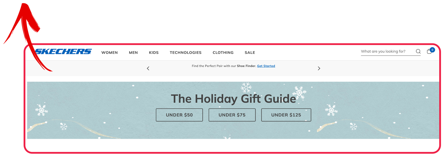
Product Filters:
Competitive analysis showed us that this is a really good feature for the user to just filter out the whole store by one selection which makes it more pocket friendly for the user or whatever the goal is during that user journey. Rieker was advised to implement this.
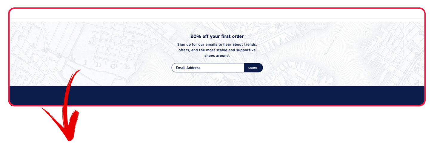
Incentivizing Users:
Great promotional element to acquire the user on their first visit through discounts on their first order. This type of incentive pushes the user over the line and helps us retain them over a significant period of time.
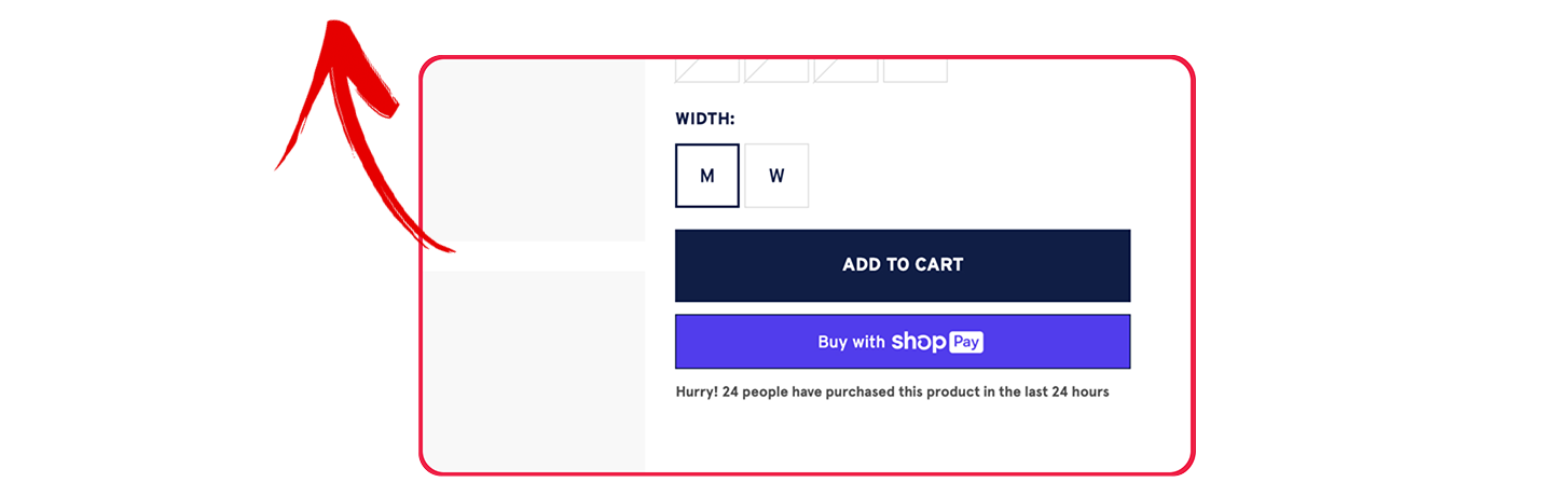
Sense of Urgency:
On the product page, a great way on Rockport site is to create a sense of urgency for the user to purchase a product, it also acts as social proof that others are buying the same product and the product will run out soon.